The fourth world, visualised
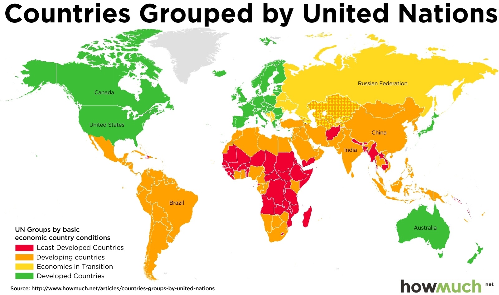
The map splits each country into four distinct categories. Developed countries are green, developing countries are orange, economies in transition are yellow and the least developed countries are red.
You can read the original post in more detail here
Source: Howmuch.net